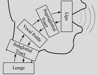
Plotting synthesized signals#
The scope of pyLeTalker is to generate a set of signals, most notably the radiated sound pressure signal or acoustic signal in short. Visualization of the synthesized signals must be done through third-party library.
Both lt.sim() and lt.sim_kinematic() functions return two objects: pout and res. The former is a length-N vector of the acoustic signal samples at the system sampling rate, which could be found as lt.fs. The N is the number of samples that you requested when calling lt.sim() or lt.sim_kinematic() function. The
second output res is a dict of simulation results generated by each of 5 elements of the model: res['lungs'], res['trachea'], res['vocalfolds'], res['vocaltract'], and res['lips']. These Results objects host both the element configurations as well as recorded samples of their internal signals.
This example demonstrates how to plot the simulation outcomes using Matplotlib. If you are not familiar with Matplotlib, please follow their Getting Started Guide to install the library.
We start out by importing letalker and matplotlib. We use the shortened prefix (lt.) to access letalker library.
[1]:
from matplotlib import pyplot as plt
import letalker as lt
Plotting acoustic waveform and its spectrum#
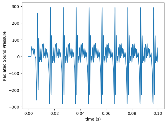
For the sake of demonstration, let’s synthesize /a/ vowel for 100 milliseconds at \(f_o =\) 100 Hz (or simulating the first 10 vocal cycles).
[2]:
T = 0.1 # duration in seconds
N = round(lt.fs*T) # =4410, number of samples to simulate
fo = 100 # fundamental frequency in Hz

pout, res = lt.sim_kinematic(N, fo, "aa")
While we can plot the acoustic signal as a function of sample index, it’s more intuitive to have the \(x\)-axis in seconds. Every Results object in the res dict contains ts item which is the corresponding time vector.
[3]:
t = res['lips'].ts # grabbing the time vector from lips element

plt.plot(t,pout)
plt.xlabel('time (s)')
plt.ylabel('Radiated Sound Pressure');
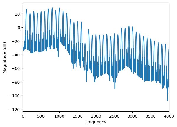
To plot the spectrum of the acoustic signal, we use plt.magnitude_spectrum() function. By default, it shows the frequency content up to the Nyquist frequency (i.e., the half of the sampling rate) which is typically too large to observe human voice behavior. So, we use plt.xlim() to only show the frequency content up to 4 kHz (or showing the first 40 harmonics).
[4]:
plt.magnitude_spectrum(pout,
                       Fs=lt.fs,     # sampling rate
                       pad_to=lt.fs, # set the resolution to be 1 Hz
                       scale="dB")   # alternately you can use "linear"
plt.xlim(0, 4000);
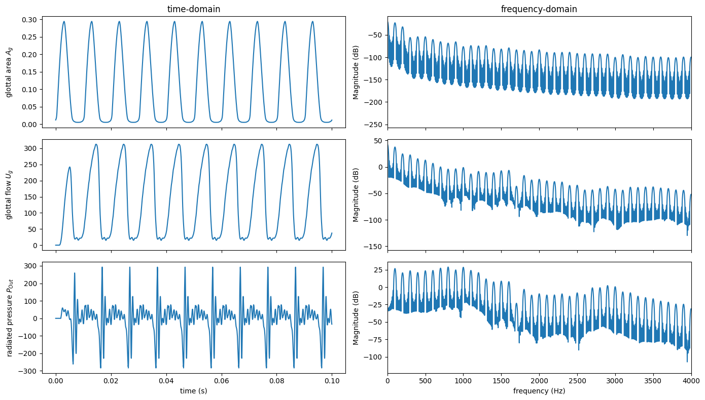
Plotting acoustic, glottal flow, and glottal area#
Now, let’s create a matrix of plots showing acoustic, glottal flow, and glottal area; both their waveforms and spectra.
The glottal flow (ug) and glottal area (glottal_area) are given in the results of the vocal-folds element: res['vocalfolds']:
[5]:
ga = res['vocalfolds'].glottal_area
ug = res['vocalfolds'].ug
Let’s layout the output to have 3 rows of signals and 2 columns (time and frequency domain) using plt.subplots(). With increased number of plots, we use a larger figure size (14 inches by 8 inches or 1344 pixels by 768 pixels).
[6]:
fig, axes = plt.subplots(3, 2, sharex="col", figsize=[14, 8])

for label, x, (tax, fax) in zip(
    ("glottal area $A_g$", "glottal flow $U_g$", "radiated pressure $P_{Out}$"),
    (ga, ug, pout),
    axes,
):
    tax.plot(t, x)
    tax.set_ylabel(label)
    fax.magnitude_spectrum(x, Fs=lt.fs, pad_to=lt.fs, scale="dB")
    fax.set_xlabel("") # remove automatically inserted x-axis labels

axes[0, 0].set_title("time-domain")
axes[0, 1].set_title("frequency-domain")
axes[-1, 0].set_xlabel("time (s)")
axes[-1, 1].set_xlim((0, 4000))
axes[-1, 1].set_xlabel("frequency (Hz)")
fig.align_ylabels(axes[:, 0])
plt.tight_layout() # useful function to automatically adjust the axes margins
Finally, you can use plt.savefig() to save the last figure as an image or fig.savefig() to specify a specific figure object. To save the above figure as my_pyLeTalker_plot.png, you need to run the following code:
plt.savefig('my_pyLeTalker_plot.png')
Plotting spectrogram#
Spectrogram is an important signal visualization to illustrate the spectro-temporal behavior. For this, we can use plt.specgram().
To make the spectrogram a bit more interesting, let’s run another simulation with a 1-second duration and design an \(f_o\) contour with lt.Interpolator.
[7]:
T = 1
N = round(T * lt.fs)

fo = lt.Interpolator([0, 0.3, 0.5, 0.8, 1.0], [100, 90, 85, 110, 120])
pout1, res1 = lt.sim_kinematic(N, fo, "aa")
The default configuration (i.e., plt.specgram(pout1, NFFT=nseg, Fs=lt.fs)) is unfit to inspect the vocal behavior. For a better outcome, we need to set three additional critical arguments: NFFT, noverlap, and pad_to. Specifically, we aimed to evaluate spectrum with a 100-milliseond sliding window, which is captured every 10 millisecond. The spectrum is calculated with frequency sample resolution of 1 Hz.
[8]:
nseg = round(0.1 * lt.fs) # 100 ms in the number of samples
noverlap = round(0.09 * lt.fs) # 10 ms offset to the number of samples overlapped
nfft = lt.fs # sampling rate =

plt.specgram(pout1, NFFT=nseg, Fs=lt.fs, pad_to=nfft, noverlap=noverlap)
plt.plot(fo.ts(N), fo(N), "r--", label='$f_o$ input') # superimpose fo
plt.ylim([0, 1000])
plt.xlabel("time (s)")
plt.ylabel("frequency (Hz)")
plt.legend();
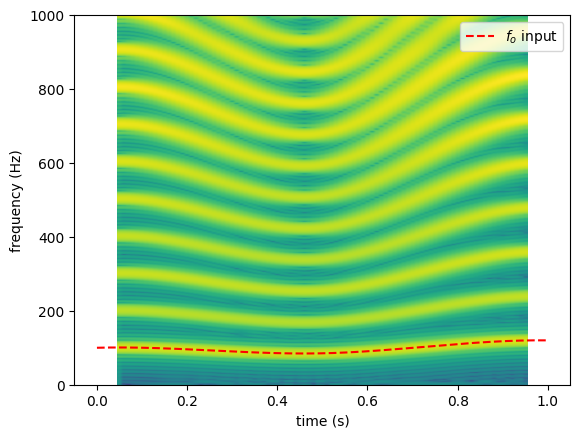
Note that the spectrogram is aligned to the center of the sliding window, thus it spans from \(t=\) 0.05 to 0.95 second. Meanwhile, the interpolated \(f_o\) input spans from 0 to 1 second.